Accessibility gets harder when it arrives late. Start with specialist input, then remove avoidable barriers to taking part.
Right or wrong, accessibility can sound like a large, specialist ‘problem’.
That can encourage an experience team to leave it for later.
The concept gets approved. The venue is booked. Technology is specified. Budgets are allocated. Then somebody asks how a Deaf guest will follow the content, where someone can escape sensory overload or whether a digital experience works without a mouse.
This Experience Briefing draws on a WXO Campfire with Christopher Morrison and distils its most useful ideas for experience leaders.
Now apparently simple changes to the experience are fighting creative and operational decisions that have already been made.
There is a more useful starting point: make accessibility part of the design brief.
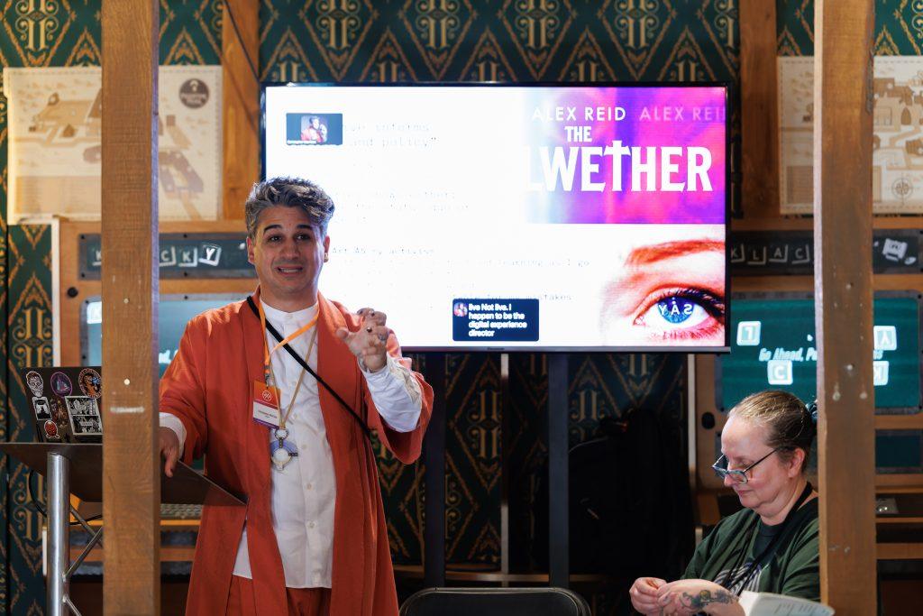
Christopher Morrison is an award-winning narrative designer whose work spans projects including Cirque du Soleil, AAA game studios and VitaNova, a hybrid live and digital musical project.
Pointedly, Morrison does not describe himself as an accessibility director.
On Vita Nova, where he is digital experience director and lead narrative designer, he works alongside accessibility director Jessica Wallach. That distinction leads directly to his first recommendation…

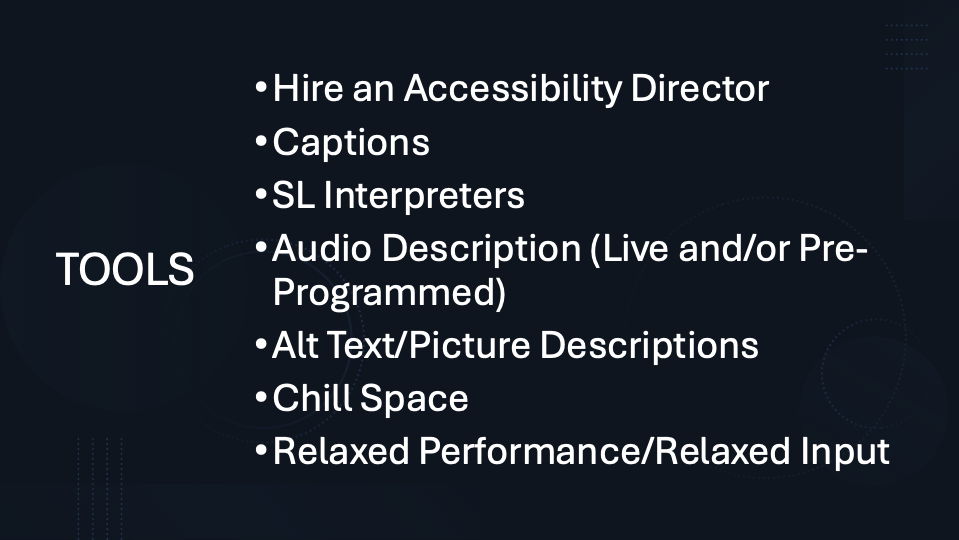
Recommendation #1: The first accessibility tool is expertise
Morrison’s first instruction is unusually straightforward:
“Hire a real accessibility director. Please. As early as humanly possible.”
Creative teams have their own experience of the world. Some will also have lived experience of disability.
However neither gives one person knowledge of every access need.
A specialist can influence choices while they are still choices:
- Venue
- Format
- Communications
- Technology
- Timing
- Staffing
- Budget
These are useful siloed specialisms when it comes to repairing a finished experience. But that approach doesn’t work for accessibility – there is no single checklist that makes an event universally accessible. Different audiences, spaces and formats – they all have different requirements.
But there are plenty of practical tools that should already be in the conversation from the start.
Recommendation #2: Can the audience receive the experience?
Start with the information and content itself.
> Captions
If spoken content matters, people need another way to receive it.
Captions are increasingly straightforward to provide, whether through dedicated systems or existing digital tools including many mainstream platforms. Morrison’s point is not simply that captions serve people with hearing loss. They have become an ordinary way for many people to follow speech. Just turn them on.
> Sign-language interpretation
Captions and sign-language interpretation do different jobs.
Sign languages such as British Sign Language (BSL) and American Sign Language (ASL) are distinct languages. For people whose primary language is sign, written captions are not an equivalent substitute.
That means understanding which audience you are designing for and providing the appropriate interpretation rather than treating “accessible to Deaf people” as one requirement.
> Audio description
Audio description (AD) makes important visual information available through spoken language.
That requires somebody to write the description and either deliver it live or record it in advance.
For digital experiences, it can become its own audio channel that users switch on when required rather than something imposed on everybody.
> Alt text and image descriptions
Digital imagery needs a meaningful textual alternative if it is to work with assistive technologies such as screen readers. Alt text and even just image captions are a big help.
The useful principle across all four tools is the same:
Do not assume everybody has to receive the experience in the same way.
Recommendation #2: Can people manage the experience?
Accessibility is also about what an event asks somebody’s body and attention to cope with.
> Give people somewhere to step out
A chill space is an obvious example.
It can support somebody experiencing sensory overload, but its usefulness is broader. Someone may have a migraine. They may be exhausted. They may simply need ten minutes away from too much noise and too many people.
Whatever the reason, a chill space enables people to manage their own needs rather than forcing them to leave the event completely.
A chill space does not need to become another programmed experience.
It needs to work as a chill space.
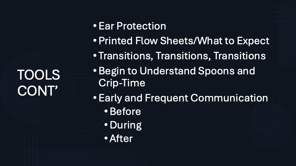
Ear protection provides another relatively simple option in noisy environments. It doesn’t need design. It needs to protect the wearer’s ears.
> Design the gaps too
Transitions in an experience are often treated as dead time.
They can instead provide valuable processing time:
- How quickly are people moved from one environment to another?
- How much time is available to understand a new instruction?
- Does somebody have to rush physically between spaces?
- Does every moment demand attention?
“How do you give them processing time inside your event?”
Morrison also asks teams to understand the ideas of ‘spoons‘ and ‘crip time‘.
In simple terms, spoons describe the finite energy somebody has available.
Crip time recognises that disability can mean activities take longer or require different pacing.
That may affect schedules and sometimes budgets. More importantly, it changes the assumption that everybody should move through an experience at the same speed.
Recommendation #3: Do people know what is going to happen?
One of the simplest recommendations in Morrison’s list may also challenge one of experience design’s favourite assumptions.
Tell people what to expect.
A printed flow sheet, webpage or simple piece of pre-arrival information can explain:
- where someone is going,
- what they will encounter,
- how long it will last,
- where the intense moments occur,
- and what happens next.
The question is predictable: won’t that spoil the experience?
The answer not so much: only for people who choose to read it.
Morrison argues that someone who wants surprise can ignore the information, while someone who needs greater certainty now has the choice to use it.
That is an important shift.
Surprise does not have to be compulsory.
A guest who knows what is coming may be able to relax enough to participate more fully.
The same principle applies to communication before, during and after the experience. People can make better choices when the access information is available before they need it.
Recommendation #4: Digital experiences can let people choose for themselves
Digital design creates its own barriers.
It also offers unusually powerful ways to remove them.
VitaNova (see video) – a self-described “game-changing hybrid sci-fi musical at the intersection of tech, theater and choice” – provides a useful example.
It combines a live theatrical production with a web-based digital environment, including a digital twin of the lobby and theatre. Its proof of concept was created for under $50,000 while accessibility was being designed into the project.
This does not prove that every accessible digital experience can be built for that budget.
But it does show that accessibility can coexist with an ambitious technical brief rather than being positioned as something that has to wait for more money.
One of VitaNova‘s design choices is particularly useful: ask about access requirements before the experience begins.
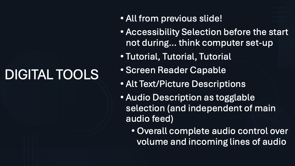
After login, users encounter accessibility settings before entering the digital experience itself.
That opens up a different model.
Rather than the designer choosing one supposedly accessible version for everybody, the user can control more of their own experience.
Recommendation #5: Borrow more from videogames
Experience designers do not have to invent every accessibility solution themselves.
Morrison points towards an industry that has spent years confronting many of the same problems: videogames.
> Teach people how to use the experience
Games use tutorials because unfamiliar interactions are environments need to be learnt.
An immersive or interactive experience has the same requirement.
Morrison argues that conventional theatre does this too, even if nobody calls it a tutorial. The room, stage, lighting and opening moments teach an audience how they are expected to behave.
Digital experiences should be equally explicit.
“You are, teaching people how to watch your shit. It’s an accessibility need.”
The language might be Morrison’s, but the production question is simple:
Have we taught people how to take part before testing whether they can?
> Give people control over what they receive
Useful digital options include:
- screen-reader compatibility and meaningful alt text
- separately switchable audio description
- independent volume controls
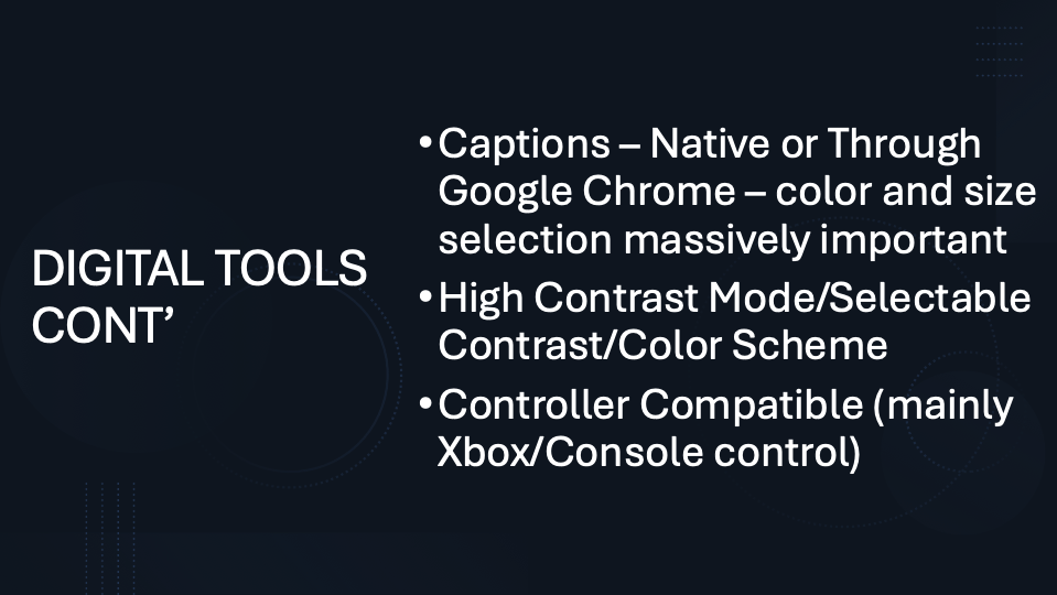
- resizable captions with adjustable colours and backgrounds
- selectable contrast and colour schemes.
These are not creative compromises.
They allow different people to reach the same experience through different settings.
Recommendation #6: Treat input as an accessibility choice
The mouse should not be the only way through a digital experience.
Morrison argues for keyboard operation and controller compatibility, noting both the ergonomic development of modern games controllers and the ways the accessibility community has adapted them to different needs.
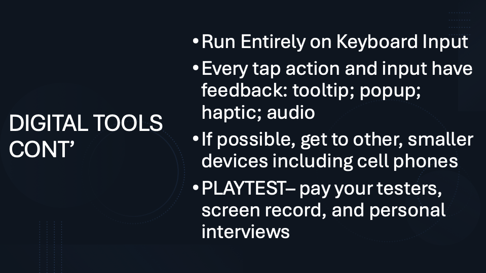
Every action should also produce clear feedback.
That might be a visual message, tooltip, sound or haptic response. The user needs to know their action has registered, and to be able to dismiss the feedback once it has done its job.
Device choice matters too.
A sophisticated experience that only works on one machine may exclude people who have already configured their phone or tablet around their individual access needs.
Which leads to one of Morrison’s more useful challenges for live experience designers.
Recommendation #7: Be careful before banning phones
Phone-free experiences can be creatively attractive. 2026 sees more becoming promoted as a solution to the doomscrolling generation.
But for some a phone is not merely a distraction.
For many disabled people it is also an everyday accessibility tool. Morrison warns that removing it without considering what it is doing for the guest can create a new barrier.
That does not mean every event must allow unrestricted phone use.
It means the design question should be:
What access functions are we removing, and how else will we provide them?
That is a smarter conversation than simply treating phones as good or bad for immersion.
Recommendation #8: Playtest access, not just the experience
The final recommendation is the one that tests whether all the others actually work.
“Playtest, playtest, playtest. Get the people whose needs you’re trying to service into the space, and see how you’re doing.”
Morrison’s recommendations around converting theory into practice are clear: pay testers, screen-record digital testing and conduct individual interviews.
This matters because an accessibility feature can exist and still fail.
- Captions can be badly positioned.
- A quiet room can be difficult to find.
- A tutorial can be confusing.
- A keyboard interface can technically work while remaining painful to navigate.
- The designer cannot know all of this from the design file.
Put your experience in front of people who use these features and watch what happens.
Then change it.
So what should count as the baseline?
There is no single collection of features or recommendations that will make every event accessible to every person.
But there is a reasonable production baseline:
- Accessibility has to have an owner early enough to influence decisions.
- Guests can find clear access information before arriving.
- Important content is available in forms appropriate to the audiences being served.
- People have some control over sensory load, pacing and participation.
- Digital experiences work with assistive technology and alternative inputs rather than assuming one mode of use.
- And the experience has been tested with people whose access needs the design is intended to support.
From there, experience teams can go much further. They can:
- Build accessibility settings into onboarding.
- Design tutorials into the story.
- Give users detailed control over audio and visuals.
- Make transitions more forgiving.
- Support several devices and inputs.
- Treat access information as part of the guest journey rather than a PDF buried on a website.
The common factor is not a particular feature.
It is designing access before somebody encounters the barrier.
Accessibility is not finished at launch
The practical nature of Morrison’s approach matters.
It avoids setting perfection as the entry requirement.
The tools already exist. Some require specialist skills and budget. Others require relatively small changes to information, timing, space or interface design.
The point is to use the appropriate ones you likely already have, see how people respond and continue improving.
“Accessibility is a journey, it is not a product.”
That is a useful standard for an experience team.
Not:
Have we made this perfectly accessible?
But:
Which barriers can we remove now, and what do we still need to learn?
What to ask in your next meeting
“Are we doing enough to make this experience accessible to the people we want to reach, or have we only added the obvious features?”
Then ask:
- Who owns accessibility, and when did they enter the project?
- What will guests know about access before they arrive?
- Can people choose how they receive and control important content?
- Where can somebody pause, regulate or step away?
- Who with relevant access needs has actually tested the experience?
The available tools are no longer the main obstacle.
The decision is whether to put them into the brief early enough to use them well.
Further reading
- How to Make Your Event More Accessible In this original version of the Campfire, Morrison’s practical approach combines together with Jenifer Toksvig’s work on designing situational and embodied access.
- VitaNova Official homepage
- How UK-based charity SpecialEffect adapt Xbox controllers for people with physical disabilities
- The Guardian on the great British switch-off: how floating retreats, mobile-free pubs and sauna book groups are liberating people from their phones
For more Experience Briefings, head here.
For more information on how to join the WXO, head here.