- Covid measures don’t have to result in a terrible experience
- What if we flipped the idea, and instead of seeing covid measures as an inconvenience, saw them as a spring board for connection and creativity?
- Nasya Kamrat and Aaron Wolfe, CEO and COO at spatial storytelling agency Faculty, look at better alternatives…
Tell me and I will forget, show me and I may remember; involve me and I will understand.
Xun Kuang
A few months ago, our creative director Aaron, went into a local computer store. He hadn’t really started shopping in person but his kid had cracked their iPad screen and at that point, the iPad was babysitter, teacher and pressure release valve for the entire family. So he went to the shop. The first thing he noticed was a massive sign on the door that read
“By order of local Health Officials customers MUST wear masks inside store.”
It was official. Cold.
Inside wasn’t much better.
He was greeted by a bored-looking man in an N95, a face shield, rubber gloves, and a disposable blue medical onesie.
He glanced at Aaron, and barked…
“Hands!”
Then he sprayed some alcohol — we hope — on Aaron’s hands before ushering him past.
Aaron’s reaction?
“It was about as pleasant as a root canal.”
So when he returned to the store a few days later to pick up his iPad, he was NOT looking forward to it.
A few weeks later, Aaron was in Western Massachusetts at a HUGE chain grocery store. By then, he had begun dreading shopping of any type. The coldness of the interactions, the panic around figuring out where to stand, the paranoia anytime anyone came too close… it all made shopping a uniquely unpleasant experience.
But what Aaron found at this otherwise generic grocery store was surprisingly pleasant.
A great sanitation station
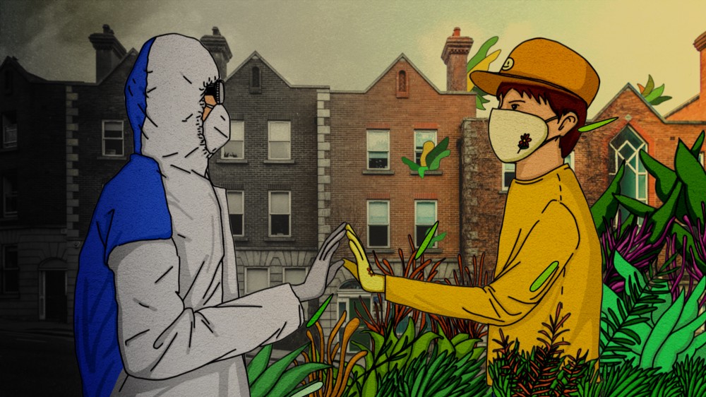
First, the “sanitation” station was located outside the store next to a beautiful display of locally-grown corn and colorful wildflowers. Rather than sanitize his hands, the attendant sanitized the shopping cart. She smiled. She was wearing a home-made flower print mask. She was outside, it felt safer, more human… almost lovely.
Now, to be clear, none of us at Faculty are medical professionals. Yes, we’re on top of every protocol that affects our business but we don’t have any secret knowledge about keeping safe other than the wholly-not-so-secret to WEAR YOUR MASK AND WASH YOUR HANDS! But what we do know is experience design.
In the pre-pandemic world, all of us spent countless hours working in the travel industry. Airlines, hotels, cruise ships, all were home to us. As we watch the airline industry struggle and our favorite restaurants close, we’ve been thinking a lot about how they might begin the road back to safety. Effective and readily available testing, therapeutics, or a vaccine will all be massive steps down the road to recovery, but as spatial storytellers, we also know that those steps alone will not be enough.
What the grocery store understood that the computer shop didn’t is that in order to open our economy back up, it’s not enough to BE safe. Customers have to FEEL safe.
And that’s where two very different lessons, one about garbage and the other about air travel, can be enlightening.
Garbage Island: Making the unpleasant, pleasant
In the mid 1990s, Taiwan had a nickname: Garbage Island. Landfills were packed to capacity, practically no one recycled, and only 70% of garbage was collected. The rest was burned or thrown into the streets. It was a seemingly insurmountable problem that compounded every single day that life continued on the island.
So what did they do?
In most cities, sanitation is one of the many invisible services that allow our lives to work the way we expect them to work. Once a week (twice if one is lucky), we pull our cans to the curb and in the middle of the night, the cans are emptied — as though by magic. It’s designed to hide the unpleasant aspects of trash collection from most of the population.
In Taiwan, the EPA did the exact opposite. They didn’t hide trash collection or make it easier. Instead, they made it very visible and gave individuals even more responsibility in the process.
Five days a week, up to three times a day in some areas, bright yellow garbage trucks drive through neighborhoods, making short designated stops. For a few minutes at each stop, people — regular, everyday people — bring their trash to the truck.
And it went much further than changing a single chore. If you walk around Taiwan, you might notice that there are almost zero public trash cans. You carry your own trash everywhere; you are entirely responsible for it.
And all of those efforts worked. Today, Taiwan is spotless and has one of the highest recycling rates in the world.
Fear of Flying: Ritualizing behavior
In August 2001, America broke the record for airplane passengers in a single month. The months that followed cratered the industry. 9/11, AA flight 587, The Shoe Bomber.
Fear was rampant. No one wanted to fly. Carriers went bankrupt.
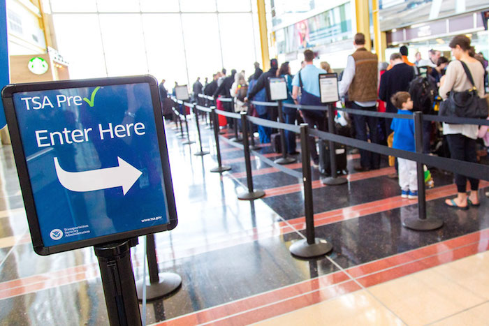
So Congress worked with airliners to create the TSA. Before the TSA existed, flight security was handled by dozens of separate contractors. The formation of the TSA did two extraordinary things: it created a unified image of security — a design that let us know that this was our government taking care of us. And instead of hiding security checks in the bowels of the airport, TSA implemented a security screening process that was distinctly visible and required active participation from everyone.
Even the large x-ray machines that examine your checked luggage were parked right in the middle of the terminal. This wasn’t just efficient; it was a design choice that said: Don’t worry. We are taking care of it. We are taking care of you.
At the outset of the TSA, we balked at the new regulations, felt oppressed by the long lines, disposed of mountains of too-large toiletries. But then the process became familiar. Even if you’re a somewhat-frequent traveler in the United States, you can probably name the exact steps you need to take in a TSA line. And you probably know the EXACT moment in the process that makes you feel like “Oh COME ON ALREADY!” But, imagine what it’d feel like if this process was eliminated. Would you feel as safe?
Lesson: Make It VISIBLE
The lesson of both these examples is that the process of keeping us safe and healthy must be made visible. It can’t be totally hidden away. It has to be front and center, require agency from participants, and have very clear steps. The process has to show that there are real stakes, and that every single one of us has a role to play. Everyone becomes responsible for their actions — and for the safety of everyone else. And as a result: we’re all safer.
But just like at the grocery store, Taiwan has shown us that an even faster route to compliance is to add a level of pleasure to the experience — a little bit of theater.
In Taiwan, as the big yellow trucks come down the streets, they blast Fur Elise.
It sounds like an ice cream truck, if said ice cream truck made recurring donations to their local NPR station. People can gather on street corners waiting for the truck to arrive and chat with their neighbors. This chore has effectively been converted into an opportunity for community building, for conversation, and for delight.
And while the TSA security check might not pass the delight test, think about TSA pre-check or CLEAR — the touchless, tech-driven screening system behind those shiny white machines. These services provide the same sense of security, but they do it in a way that makes every user feel special.

Let’s Make The New Normal Not Just Functional, But Better
When reimagining the new norms of the post-Covid world, we need to instill some of these principles. We all know that the rules have changed because of Covid — it would be a mistake to hide these and pretend we’re still living in a pre-pandemic world. But the experience can still be seamless and pleasant.
#1 Temperature sensing plant
For example, a temperature check might make good policy sense. But a gloved attendant isn’t going to cut it.
Imagine this instead: a temperature sensor embedded in a potted plant that discreetly displays your temperature. You know you’re being taken care of and you know others are as well.
Done correctly, these experiences can even feel like luxury. You know how some restaurants or flights give you a hot towel? For a second, it makes you feel like you’re in a spa — but really, they’re making you wash your hands, something we all should be doing now.
The goal — sanitation and safety — has to be in lock step with the experience.
#2 Scented swabs
Swabbing a guest’s cheek — potentially necessary — feels sterile and clinical. What if instead, you gave guests a beautiful dispenser and mint-scented swabs, putting the agency back in their hands and providing a little value add?
#3 Distancing reimagined as… a private picnic or romantic greenhouse
Or instead of just distancing tables at a restaurant, what if you made each table a mini-environment, like a private picnic or even a romantic greenhouse?
(See the very Instagram-able ‘igloo pods’ that popped on London’s South Bank in October 2020, and more on how Napa Valley’s Electrica turned their patio ito a series of private picnic spaces.)
There are so many opportunities to infuse these small touches that appeal to people’s senses while fulfilling their needs for comfort and safety in this moment:
- A soft warm towel to wipe off the excess water after a ritual hand washing.
- A lovely lavender mist along with the disinfectant spray you need
- An inviting coconut scent paired with the UV burst that disinfects your electronics.
All of this comes down to one simple take away — something that we’ve learned over and over again in our work as experience designers and spatial storytellers. The elements of the user journey might be fixed in time and space but that’s not always the important part. The important part is often how the guest experiences those elements. What they feel about every step of their journey. With clever design, a human-centric orientation, and a bit of narrative know-how, we can convert even the most drab and unpleasant experiences into something delightful and inspiring.
Hot towel anyone?
About The Authors: Nasya Kamrat & Aaron Wolfe
Nasya is a member of the WXO Founding Circle, and an award-winning futurist and creative strategist who works and plays at the intersection of strategy, storytelling, design, and technology. In 2012, she founded Faculty, a certified women-owned spatial storytelling agency that creates bespoke, human-centric experiences for global brands—IRL and URL.
Aaron is the CCO at Faculty, travelling the world to create story-driven and human-designed experiences for global brands. In addition, he’s an award winning filmmaker whose films have been featured at Sundance and shortlisted for an Academy Award as well as a celebrated storyteller for The Moth RadioHour and Podcast.


